How to create a responsive and animated navbar using vanilla HTML, CSS, and js for beginners


Creating a responsive navbar without using any framework.
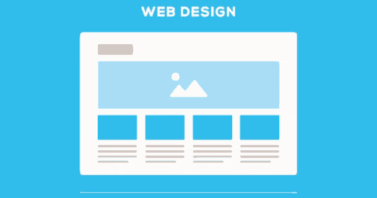
The goal of a Responsive web design is about making web pages look good on all devices.
A responsive web design will automatically adjust or adapt to different screen sizes and viewports.
But a major issue in today's developers is that many of the new developers are fully dependent on frameworks like bootstrap and don't even know how to implement it without using any framework
My other blogs
My Github
My personal website
Complete Preview
Complete source code here
Note: If you already know how to set up fonts and set up the files then you can skip to the navbar part
Steps:
1. Setup the HTML, CSS, js files and icons images :-
We will create an index.html file in the root directory of our project folder and write the boilerplate code.
<!DOCTYPE html>
<html lang="en">
<head>
    <meta charset="UTF-8">
    <meta http-equiv="X-UA-Compatible" content="IE=edge">
    <meta name="viewport" content="width=device-width, initial-scale=1.0">
    <title>Document</title>
</head>
<body>

</body>
</html>
Now we will create a styles.css file in our css folder and an index.js file in our js folder and link it to our index.html file.
<!DOCTYPE html>
<html lang="en">
<head>
        <meta charset="UTF-8" />
        <meta http-equiv="X-UA-Compatible" content="IE=edge" />
        <meta name="viewport" content="width=device-width, initial-scale=1.0" />
        <title>Document</title>


        <!-- stylesheets -->
        <link rel="stylesheet" href="./css/styles.css" />
    </head>
    <body>
        <script src="./js/index.js"></script>
    </body>
</html>
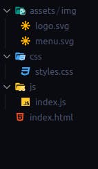
In the end you can add the icons in the assets folder
Icon 1
Icon 2
Complete folder structure till now
2. Write some basic CSS
Now we will write some CSS code to reset some default properties
* {
    margin: 0;
    padding: 0;
    box-sizing: border-box;
}

a {
    color: inherit;
    text-transform: inherit;
    text-decoration: inherit;
}

li {
    list-style: none;
}
button {
    outline: none;
    border: none;
    background-color: inherit;
}
body {
    width: 100vw;
    overflow-x: hidden;
}
3. Add a custom font
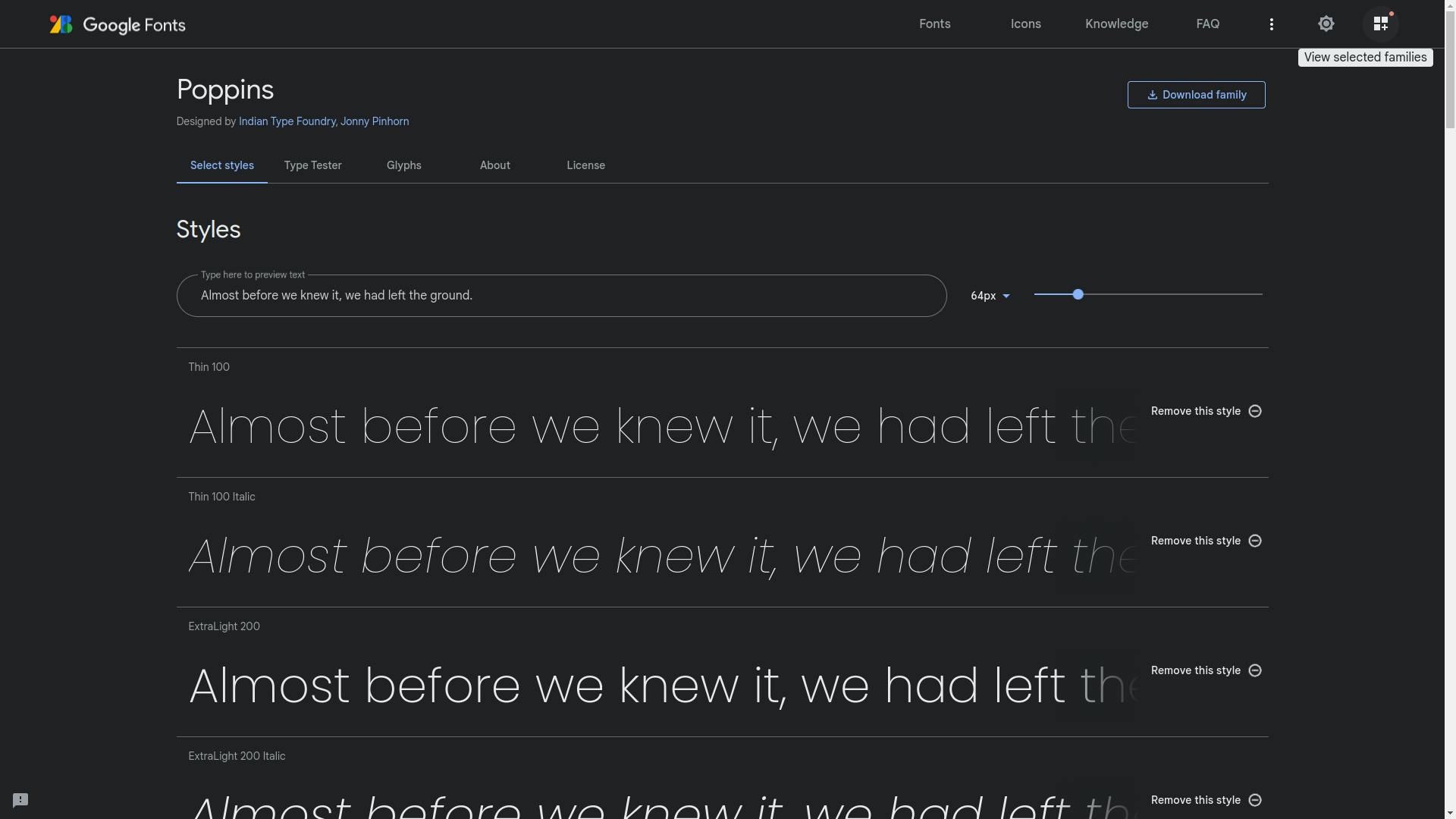
Now we will import a custom font using google fonts for our navbar For this navbar I am going to use the Poppins font
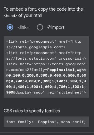
We will start by selecting all the font styles we want and then we will open the selected families dashboard by clicking on the "view selected families" button on the top right of the page. (Note: For most of you the dashboard will be opened from the beginning)
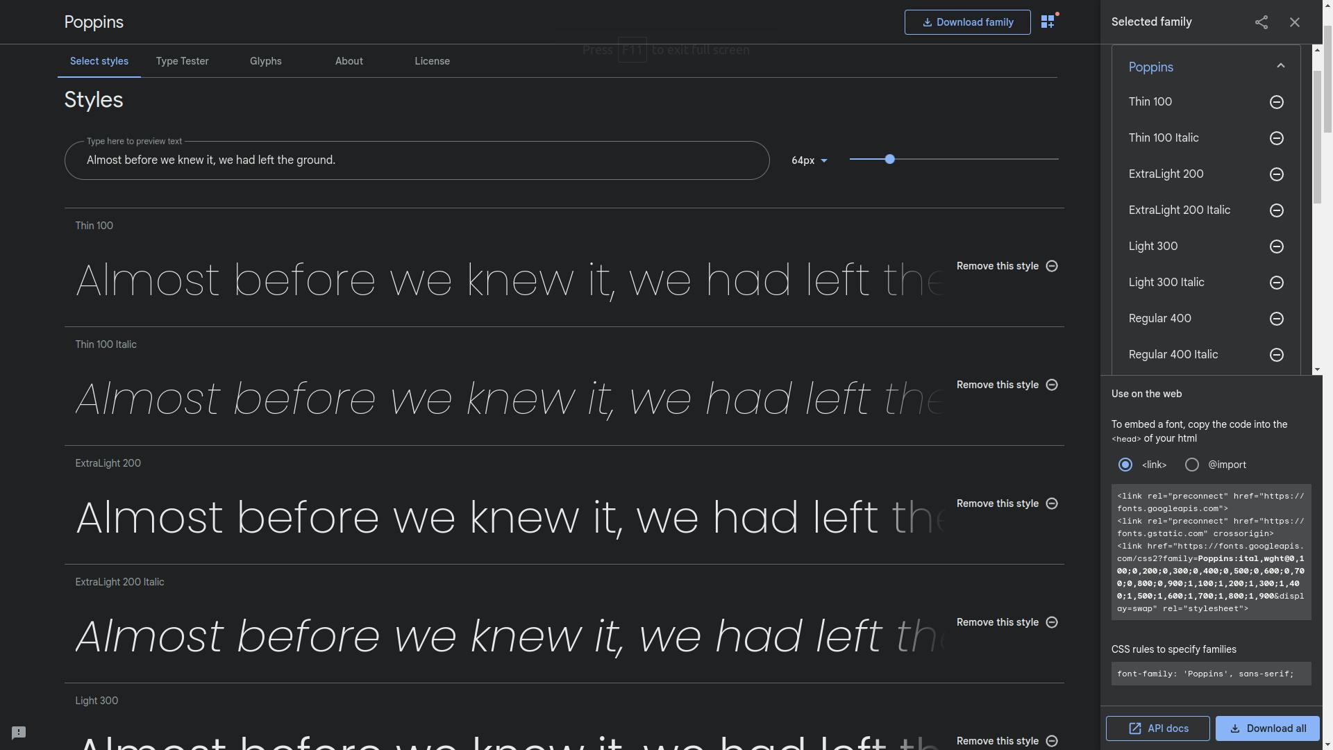
Now we will copy the link from the dashboard and paste it into the head tag in the index.html file.
<!DOCTYPE html>
<html lang="en">
<head>
        <meta charset="UTF-8" />
        <meta http-equiv="X-UA-Compatible" content="IE=edge" />
        <meta name="viewport" content="width=device-width, initial-scale=1.0" />
        <title>Document</title>

        <!-- google fonts -->
        <link rel="preconnect" href="https://fonts.googleapis.com" />
        <link rel="preconnect" href="https://fonts.gstatic.com" crossorigin />
        <link
            href="https://fonts.googleapis.com/css2?family=Poppins:ital,wght@0,100;0,200;0,300;0,400;0,500;0,600;0,700;0,800;0,900;1,200;1,300;1,400;1,500&display=swap"
            rel="stylesheet"
        />


        <!-- stylesheets -->
        <link rel="stylesheet" href="./css/styles.css" />
    </head>
    <body>
        <script src="./js/index.js"></script>
    </body>
</html>
and finally, we will specify the font family we want to use in our styles.css file by adding the following line
font-family: "Poppins", sans-serif;
Note: this line can be copied from the google fonts page from the selected families dashboard.
Our final CSS code
* {
    margin: 0;
    padding: 0;
    box-sizing: border-box;
}

a {
    color: inherit;
    text-transform: inherit;
    text-decoration: inherit;
}

li {
    list-style: none;
}
button {
    outline: none;
    border: none;
    background-color: inherit;
}
body {
    width: 100vw;
    overflow-x: hidden;
    font-family: "Poppins", sans-serif;
}
Now we can get started with the navbar.
4. Write the HTML code for the navbar
First, we will add all the elements of the dashboard in the index.html file and give them appropriate classes
<body>
        <nav class="navbar">
            <div class="container">
                <div class="logo">
                    <a href="https://chirag.codes">
                        <img src="./assets/img/logo.svg" alt="logo" />
                        <span>Chirag</span>
                    </a>
                </div>
                <ul class="nav-items">
                    <li class="nav-item"><a>About</a></li>
                    <li class="nav-item"><a>Pricing</a></li>
                    <li class="nav-item"><a>Features</a></li>
                </ul>
            </div>
        </nav>
        <script src="./js/index.js"></script>
    </body>
5. Write CSS code for the navbar
we will start by writing CSS code for the .navbar class
.navbar {
    width: 100%;
    padding: 10px 10%;
    background-color: aliceblue;
    position: relative;
}
There is a reason we are giving the position relative to the navbar which we will see when we are making the navbar responsive for mobile designs
Now the .container class
.container {
    display: flex;
    justify-content: space-between;
    align-items: center;
    width: 100%;
}
Now for the logo and brand name
.logo a {
    font-weight: bold;
    display: flex;
    justify-content: center;
    align-items: center;
    font-size: 1.4rem;
}
.logo img {
    max-height: 40px;
    margin-right: 5px;
}
.nav-items and .nav-item
.nav-items {
    display: flex;
    justify-content: center;
    align-items: center;
    margin-left: auto;
}
.nav-item {
    margin: 10px;
    font-size: 1.2rem;
}
.nav-item a {
    cursor: pointer;
}
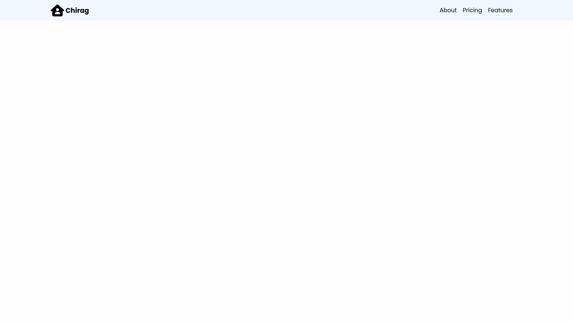
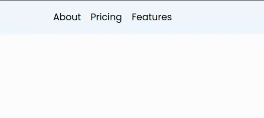
The current condition of our navbar
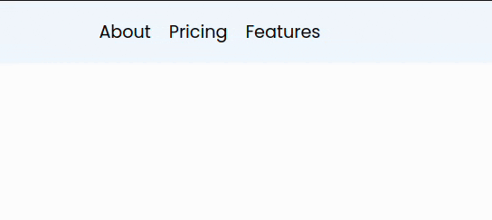
Next We will add a menu to our Features .list-item something like this
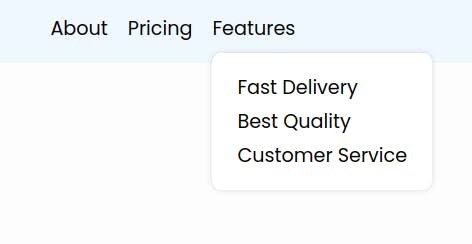
6. Adding Html for the menu
We will just add a .nav-list class to the nav-item in which the menu has to be added.
and one more list of items for the menu with the nav-list-items inside the .nav-item
<li class="nav-item nav-list">
       <a>Features</a>
      <ul class="nav-list-items">
            <li>
                      <a href="#"> Fast Delivery </a>
            </li>
            <li>
                     <a href="#"> Best Quality </a>
            </li>
            <li>
                   <a href="#"> Customer Service </a>
            </li>
     </ul>
</li>
7. Adding CSS for the menu
We cannot position the .nav-item-lists using margin and padding so we will have to use position: absolute in .nav-list-items and we have to make sure that its position and size is relative to the .nav-list in which it is present so we will add a position: relative to
.nav-list
.nav-list {
    position: relative;
    cursor: pointer;
}
.nav-list-items {
    z-index: 100;
    position: absolute;
    width: max-content;
    padding: 15px 20px;
    background: white;
    border-radius: 10px;
    top: 100%;
    box-shadow: 0px 0px 5px 1px rgba(0, 0, 0, 0.1);
}
.nav-list-items li {
    margin: 5px;
}
We have to make sure that the menu is only displayed when the cursor is hovered over .nav-list. So we will add a display: none to .nav-list-items and and a hover effect to .nav-list:hover .nav-list-items like this
.nav-list-items {
    z-index: 100;
    position: absolute;
    width: max-content;
    padding: 15px 20px;
    background: white;
    border-radius: 10px;
    top: 100%;
    box-shadow: 0px 0px 5px 1px rgba(0, 0, 0, 0.1);
    display: none;
}
.nav-list:hover .nav-list-items {
    display: block;
}
8. Adding animation to our menu
Now let's add some animation to the menu
For that, we will first add keyframes in our css and add it to our .nav-list:hover .nav-list-items
.nav-list:hover .nav-list-items {
    animation: nav-list-animation 1s;
    display: block;
}

@keyframes nav-list-animation {
    0% {
        opacity: 0;
        transform: translateY(5px);
    }

    100% {
        opacity: 1;
        transform: translateY(0);
    }
}
keyframes are used to define CSS values during a time period in the animation
Result:
This added a nice smooth animation to our menu.
9. Making the navbar responsive
We will start by adding a .toggle-button in the html just after our .nav-items
               <ul class="nav-items">
                    <li class="nav-item"><a>About</a></li>
                    ...
                </ul>
                <div class="toggle-button">
                    <button>
                        <img src="./assets/img/menu.svg" alt="menu" />
                    </button>
                </div>
Next we will add the css for the button
we don't want it to display on large screens so we will add a display: none to the .toggle-button
.toggle-button {
    display: none;
    height: 40px;
}
.toggle-button button {
    height: 100%;
    padding: 5px;
}
.toggle-button img {
    max-height: 100%;
}
Now to actually make navbar responsive we will use media queries to define different css code for different screen width
So, we will define the following media query
@media screen and (max-width: 600px){}
This media query just means that every css code written inside is only applicable for devices with screen width less than 600px;
Note: Every CSS code written inside a media query is given more importance than the CSS code written outside the media query
Next we will add the necessary css code inside the media query.
@media screen and (max-width: 600px) {
    .toggle-button {
        display: block;
    }
    .nav-items {
        display: none;
        position: absolute;
        width: 100%;
        top: 100%;
        left: 0;
        flex-direction: column;
        background-color: aliceblue;
        align-items: baseline;
        padding: 10px 10%;
    }
    .nav-items-active {
        display: block;
    }
}
Again we can't position the nav-items using margin and padding so we will use position: absolute and this time it will be relative to the .navbar as we added position: relative to it in step 5
And we don't want it to display until the toggle button is clicked so we will add a display: none to it and then define one more class .nav-items-active with display: block which we will use to change the state of our nav-items
Now how do we add the class .nav-items-active and remove it on every click on the toggle button?
For that we will use javascript
So let's open our index.js and write the following code
const navList = document.querySelector(".nav-items");
const toggleButton = document.querySelector(".toggle-button");

toggleButton.addEventListener("click", function () {
    if (navList.className.includes("nav-items-active"))
        navList.classList.remove("nav-items-active");
    else navList.classList.add("nav-items-active");
});
This adds an event listener to our toggle button and adds the class .nav-items-active to .nav-items if it is not present otherwise removes it.
That's it for our navbar, See you later